Our ancestors moved around. Some of them moved a lot and some moved long distances. These events are known as migration, and this can be mapped.
People were born, got married, died and were buried. Not always in the same town or even country. You have taken the time to insert that information into your TNG site, adding persons and vital data to their profile. Now let’s have a fresh look at all that information. Let’s get out a map and add chart pins to wherever your ancestors showed up. If you want the fancy term, it is called spatial analysis, or we can just call it migration mapping.
NOTE: this migration mapping tool depends on TNG sites with good geocoding of places. No geocode information means no pins on the map.
To get started, go to the Migration Map page by clicking this link, or finding it on the homepage. On the mapping page, you see several features and selections. The top bar has some quick instructions. Below that, there are several selection pull-down lists, for picking the surname of interest and possible trees and branches, as well as a timeline slider, and then the Google map itself. Let’s get started.
Surname/tree/branch
These three choices are pull-down lists.
Start with the Surname. This list shows the available surnames (also see the table of Surnames of TNG). Each surname also shows a number. The number is the count of individuals in the study. Note that a high number, above 10,000 and beyond, may take many minutes to extract the data from the database and to render on the map. Very large studies may not be suitable for this tool.
If desired, you can narrow down the results by selecting a tree and then a branch. Each TNG study has at least one tree and each tree may have some branches. Click on the Tree selection list to see what is available. Then, if desired, you can check whether that tree also has Branches.
By selecting a tree and selecting branches, you narrow down the people to be mapped. This helps to keep the map from getting too cluttered and also shortens the map rendering delay. Or, you can leave trees and branches set to “ALL”. Click on OK.
Okay. You might get a surprise. The Surname list has shown lots of individuals, but zero got mapped (none). What happened? That particular study had people, but the events were not mapped in the TNG site. That is, the events were not geocoded.

But let’s say you find a surname with geocoded locations, as in the example, above. But again, note the possible discrepancy. Only 3,196 people were mapped out of 7,966 possibles. As in any genealogy study, sometimes we just get names and dates, not always locations. But we can work with what we get.
The timeline slider
What about that Born Between? Migration Map has checked through the dates that were picked up from the backend database and has informed you of the earliest and latest found dates, as shown in the “Born Between” display. And has offered you a slider tool to narrow down the date range. You can adjust the left slider and the right slider to get better focus on your ancestors’ migration patterns. If you do make a slider adjustment, click OK again for the map to update with the new data.
Note: if you do narrow down the timeline, then the rendering of the map is quicker. This is because the rendering process has less data to draw on the map.
Note: the “Born Between” stops at 1917. This was set up for privacy protection rules. Please visit the surname site with appropriate login credentials if you need more recent information.
Map icons

Just above the map, there are four icons with checkboxes: Births, Marriages, Deaths, Burials. These select what dates with locations will show up on the map. The fifth checkbox, Migrations, controls the map migration lines.
Map settings
In the upper-left corner of the map, you can select the map background to be either:
- Map: Country/state/province outlines
- Terrain: same, but with elevation relief, or
- Satellite view.
The Google map can be zoomed in. In the lower-right corner you will find the “+” and “-” controls. If you have a mouse with a scroll wheel, you can hold down the control key “Ctrl” and then scroll in or out.
Mapping examples
Alright, you have made the selections and there are people to be mapped. What do you see?
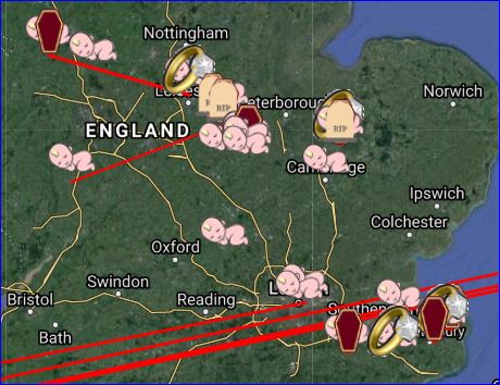
Here is an example map shot of the Beeby study. The icons are scattered across the landscape, showing you where births, marriages, deaths and burials took place. Assuming we have that data named, dated and geocoded. Try clicking off some of the icons and see the changes. That also helps clean up the map display for you.
Next, hover your cursor over any of the icons. You get a pop-up of information on that person and the event.
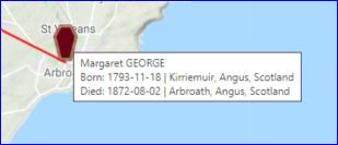
For example, here we have Margaret George, died on 1872 in Abraoath, Scotland.
But also, the icon can be clicked. That action adds a table of information on that location, above the map. See below. The table shows ALL the events for that location. Even though you might see only one icon, such as the death icon in this example, the table will list that and perhaps many more events. In any case, in the table, the name is clickable and that will take you inside the TNG site, in a new browser window, to the profile page for that person.

There is one more table, and it is below the map. This table is a listing of all the individuals being presented on the map, with columns of name, birth and death dates and places, plus the tree name and branch name. You can click on the person in the name column to again, visit the profile page in the TNG site.
Migration lines
The Migration lines. Now we get to see the migration movements of your ancestors. This time, we are looking at the cross-Atlantic and inter-state migration for the Whittle surname study. Looking at the Whittle example and zoomed in on the east coast of the United States, map is obliterated with red lines. Can we make more sense out of this mess?
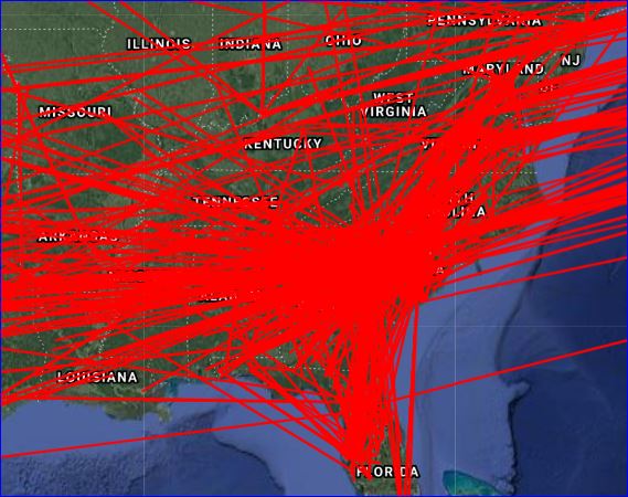
First, all the icons were unchewcked to clean up the map a bit. Then the timeline slider control was used to narrow the time window. We set a “Born Between” range of 1910 until 1917. And as a benefit, the rendering time was improved from about two minutes down to a few seconds.
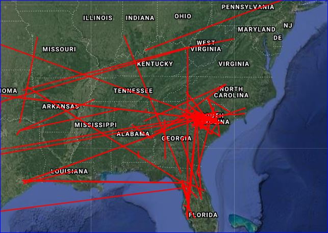
Much cleaner. We can see the concentration of family in the South Carolina state, with movement throughout the east and the south-east. If we zoom in, the epicentre appears to be Columbia, SC. By playing around with the timeline slider, you can identify the first settler of a particular location, such as a state, city or town.
Use the tool to isolate reasons for migration, or for travels. For instance, you may be interested in health or political or conflict motivations, such as plague, famines and wars. For those causes, include the death and burial icons with the migration lines.
And now to enjoy. After doing all of your hard work in setting up that data in your TNG site, please sit back, play with this interactive map and track your meandering ancestors.
